Bizzy Group Internship

Project Overview .
CONTEXT
Bizzy Indonesia, is a business-to-business supply chains company based in Jakarta with the goal of building an integrated procurement, logistics and distribution platform to drive transparency and efficiency for businesses in Indonesia.
During this internship, I was responsible for redesigning the company’s transport management system (TMS) which is used by the branch managers and traffic administrators to handle daily logistics and distribution operations within the company where it is currently used in 27 distribution centers across Indonesia.
PROBLEM
Users are frustrated with the time it takes for them to complete daily tasks and many complained about how the system is incredibly difficult to use.
My Internship Journey
Analyzing The Current System .
I began by exploring the TMS to familiarize myself with the user flow and available functionalities. From my analysis, I saw how the platform, as a whole, was unintuitive and inconsistent. I identified the specific areas where improvements could be made.
INSIGHT I
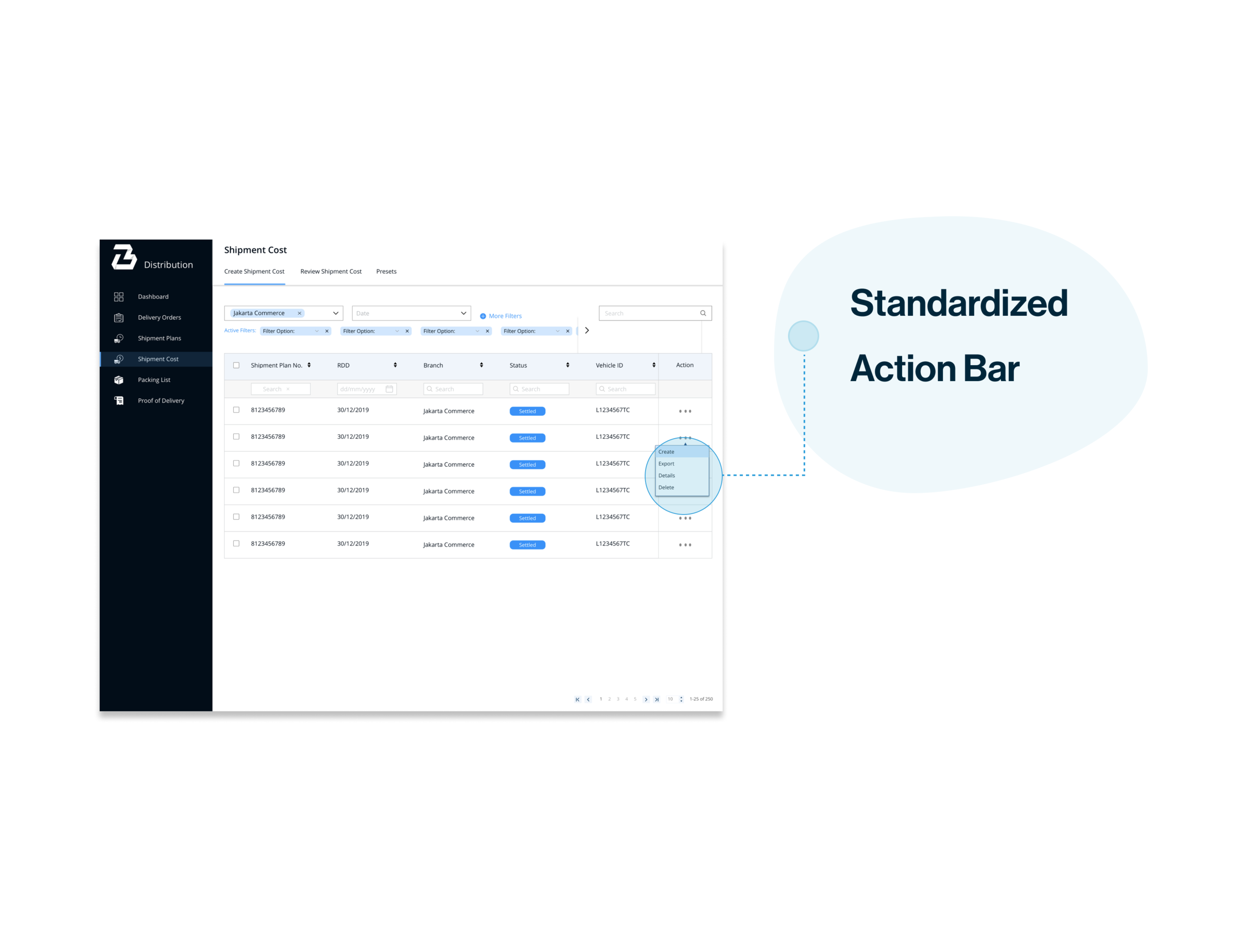
The Action buttons found throughout the platform were scattered everywhere. The screenshots on the right shows how different the buttons are within the system.
INSIGHT II
Layout of search and filter function differ through the system making the platform confusing.
INSIGHT III
Poor affordance made the existing system unintuitive. For instance, as seen on the screenshot on the right, the Call to Action button is visible although no prior interactions were made.


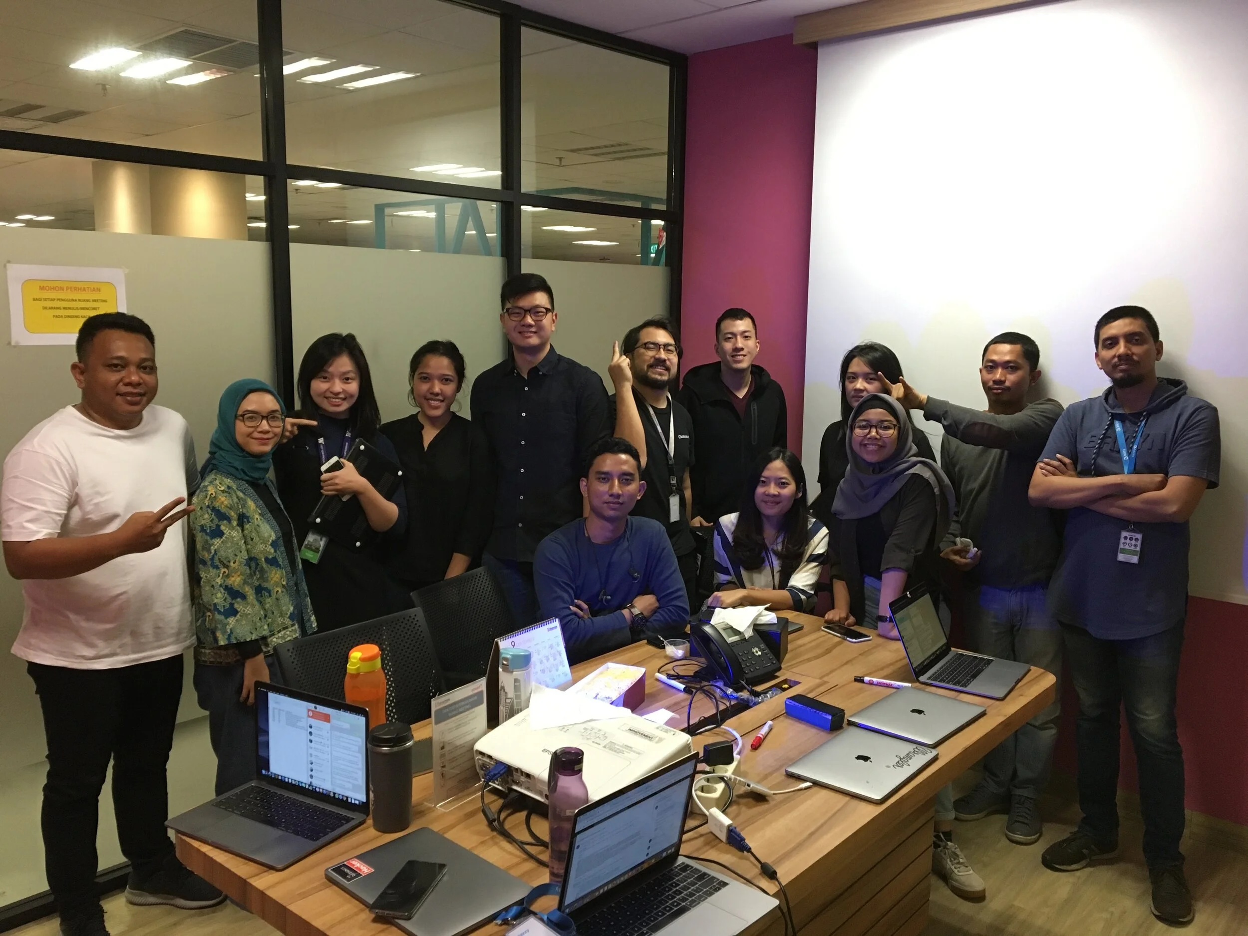
Getting To Know The Users .
I wanted to truly understand how the users were interacting with the current system, thus I visited 2 of the distribution centers to conduct user research. For starters, I shadowed one of the administrators for a day at one of the distribution centers to gain a true sense of users’ actions, decision patterns and routines when using the TMS.
Wanting to gain better insights on users’ intents and detailed accounts of their behaviors based on their experience with the TMS, I also conducted three semi-structured interviews with users who used the system on a daily basis and one with a user who was new to it. In addition, I was also able to verify my findings from my observational study during this process.
INSIGHT I
While observing the users interact with the system, I how the data tables often showed irrelevant and inaccurate information. Furthermore, users expressed how the inconsistent components within the system resulted in steep learning curves.
INSIGHT II
Users have no way to track newly added data entries and I found that users have to make a physical checklist to keep track of their own task.
INSIGHT III
Users can only filter one item at a time, resulting in a highly inefficient system.


Design Question .
I realized that data tables were the most prominent feature on the system thus prioritized the need to improve them. I scoped the overarching problem with a design question to help guide me develop my solutions.

How can I design data tables that are visually consistent and efficient for the users?
User Goals .
I developed 3 key design requirements that were essential in improving the users’ experience.
CONSISTENT DESIGN .
As a user, I want the system to be predictable and easy to learn.
EFFICIENT .
As a user, I want to be able to perform multiple actions at once.
CONVENIENT .
As a user, I want to be be able to keep track of my tasks easily.
Ideation .
With the design question in mind, I began to ideate potential solutions through sketches. The final sketches were selected based on priority and feasibility.

Design Critiques .
We had a difficult time thinking about how we could implement our solution in a novel way. The use of smart watches and glasses were unique but I eventually made the decision to go with a mobile app because it was the most accessible and convenient platform.


Final Solution .
After several rounds of iteration, I designed the high-fidelity mock-ups while taking into considerations the feedback from users and constraints faced by the engineers. I used a soft 8-point grid to provide better structure and consistency for the system.


Final Reflection .
Interning at Bizzy was absolutely amazing where I felt that I have grown tremendously as a designer. This internship did not only allow me to develop my technical skills but I also had the chance to make a lasting impact within the company. During my time there, I had the opportunity to share and show my colleagues the true value of human centered design!